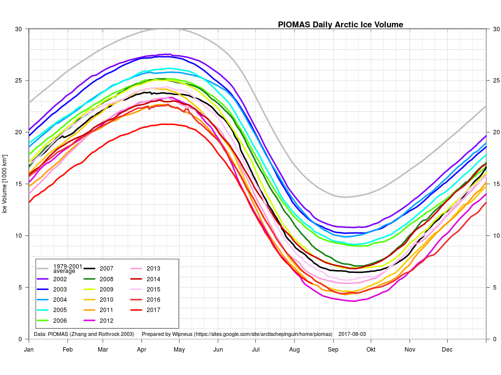
What seems likely to be the most interesting period of the 2017 Arctic sea ice melting season is upon us! The PIOMAS gridded data hasn’t been released yet, but the overall volume numbers reveal that 2017 has now relinquished its “lowest ever” position to 2012. Here’s Wipneus’ graph of the volume data:

plus his anomaly plot:

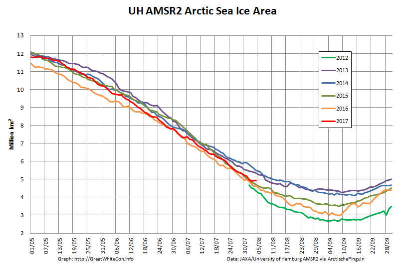
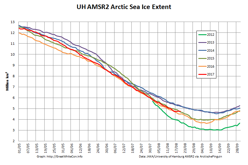
Our favourite high resolution AMSR2 area and extent graphs now also allow comparison with 2012. Here’s how they look at the moment:
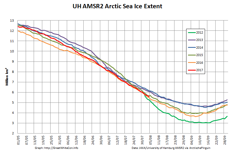
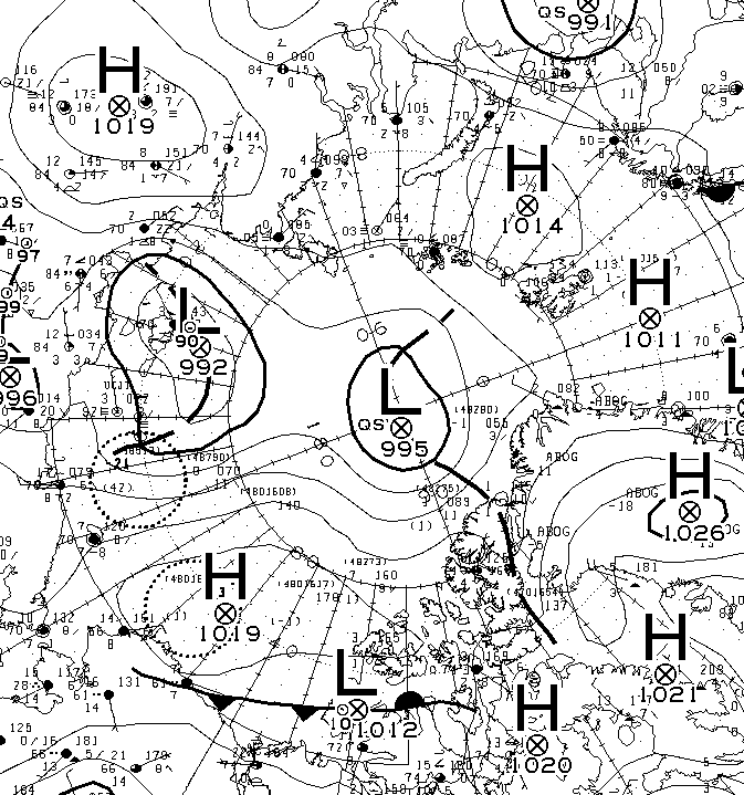
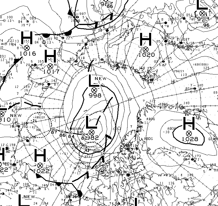
As you can see, round about now is when 2012 Arctic sea ice extent started to noticeably race ahead of the rest of the pack. Will 2017 follow suit? Are there any Arctic cyclones on the horizon for example? Well, the one forecast for August 4th hasn’t materialised. Here’s this morning’s Environment Canada synopsis:
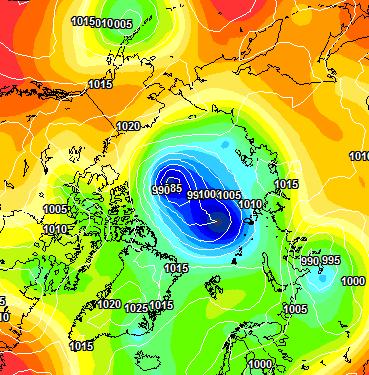
However both ECMWF and GFS agree that a sub 985 hPa storm should have arrived by Sunday morning. Here’s the ECMWF version from MeteoCiel:
There’s stronger storms in the forecast further out, but once again we’ll believe them if and when we see them!
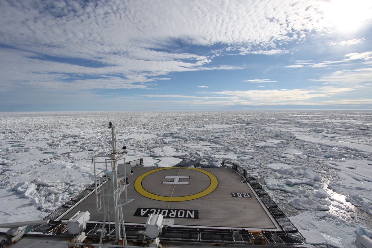
We’re keeping a close eye on the Northwest Passage once again this year. Most of the southern route is open already, but as we predicted the old ice in Larsen Sound has a lot of melting still to do. Here’s how it looked from the icebreaker Nordica a few days ago:
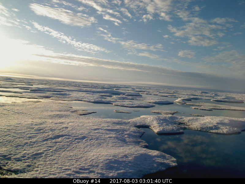
On top of that the old ice around O-Buoy 14 is currently rushing south down the McClintock Channel to replenish it. Here’s how that looks at the moment:
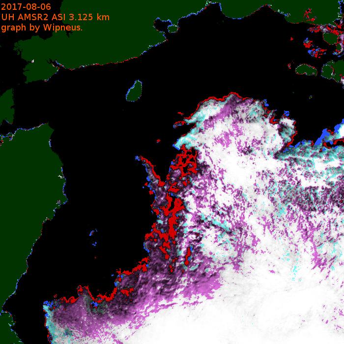
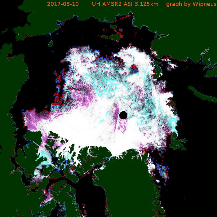
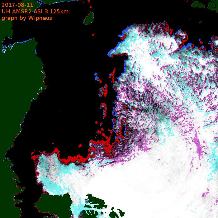
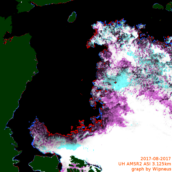
Meanwhile the melt along the Northern Sea Route is well ahead of last year. Here’s the University of Hamburg AMSR2 concentration map of the area:

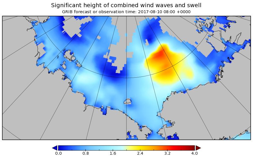
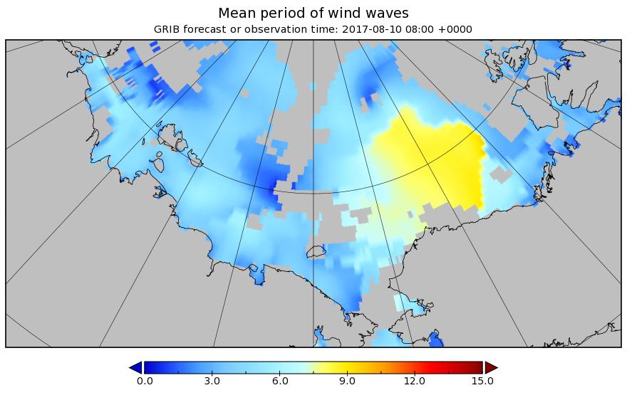
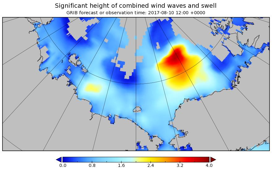
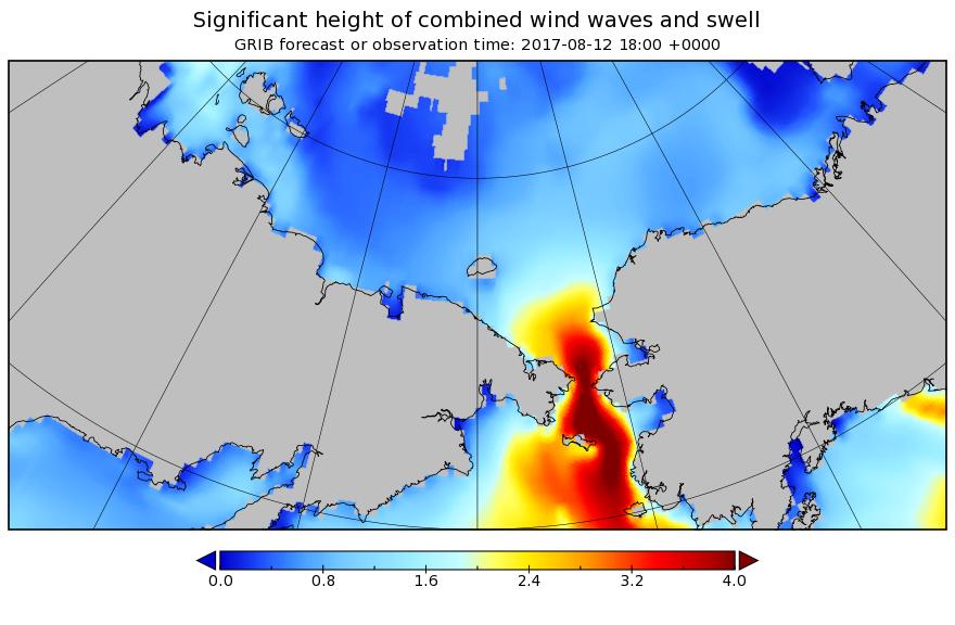
There’s also now a lot of open water on the Pacific side of the Arctic, and Sunday’s cyclone is forecast to create a large area of 2 meter plus waves heading in the direction of the ice edge:
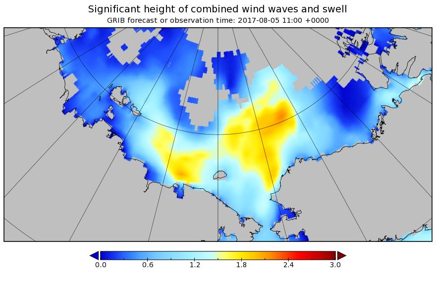
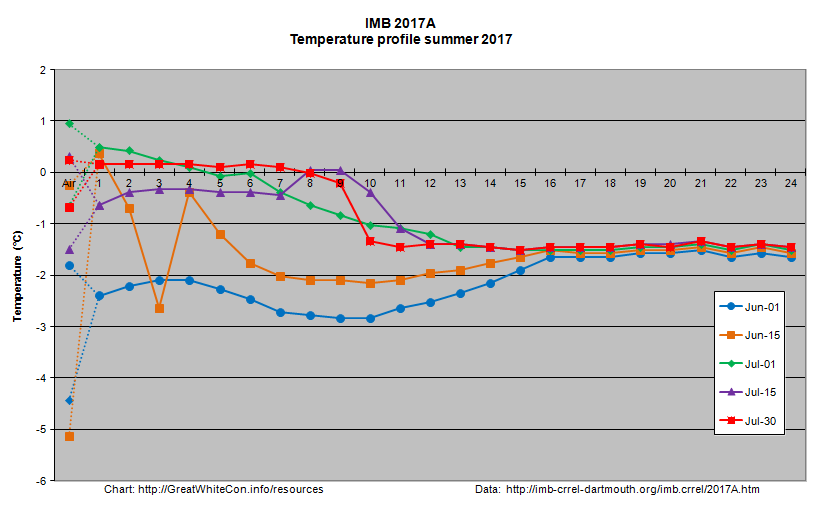
I expect that to have a noticeable effect on the already fragile sea ice by early next week, assuming the storm arrives as forecast! There is an ice mass balance buoy handily placed out on the ice in the path of the storm. Buoy 2017A is currently located near 77 N, 147 W, and its assorted sensors suggest the ice underneath it is now less than 20 cm thick:
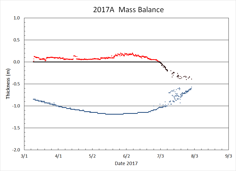
Here’s how the area around the buoy looked a couple of weeks ago:
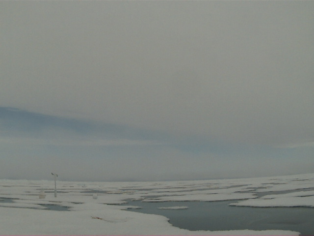
Image of 2017A from WARM 6 on July 18th 2017. NSF project: NSF OPP #1603548
The $64,000 question now is will the 2017 Arctic sea ice metrics stay in amongst the recent pack, or race after 2012 instead?
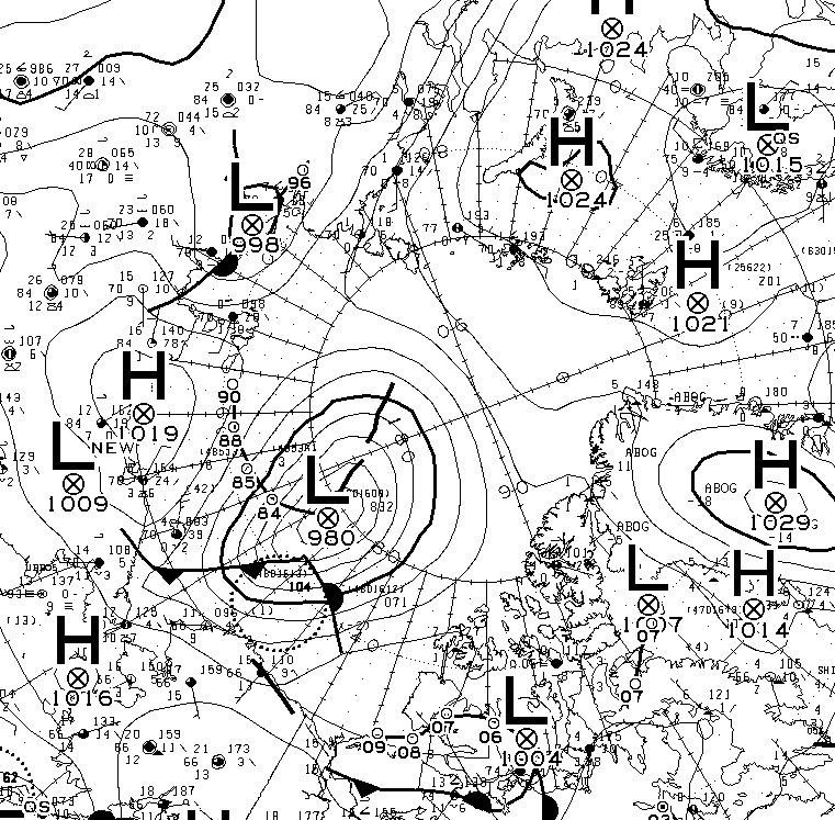
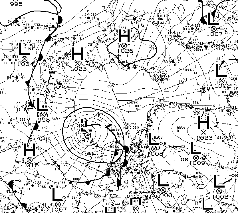
This morning’s synopsis from Environment Canada suggests the cyclone has bottomed out at a MSLP of 982 hPa:
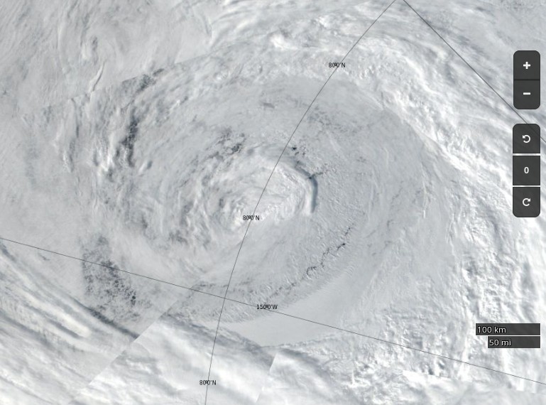
Here’s how the cyclone looked from space yesterday:
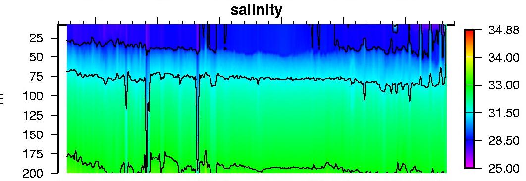
I think that I can convince myself that the salinity profile from ice tethered profiler 97, currently located at 73° N, 134° W, reveals mixing from depth in the wake of the storm:
The synthetic aperture radar on the Sentinel 1B satellite can certainly see through the clouds, and reveals open water in the Central Arctic north of the Beaufort Sea yesterday evening (UTC):

Here is Wipneus’ latest AMSR2 concentration delta map:
The effects of this weekend’s storm are readily apparent! Just in case you’re wondering Wipneus reports:
Area: -172.0 (+324k vs 2016, +138k vs 2015, -669k vs 2014, -523k vs 2013, +493k vs 2012)

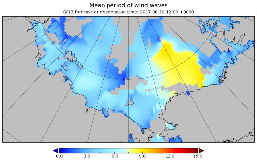
The next pulse of swell is currently forecast to be somewhat higher and longer period than the last one. This one is also taking aim at the Beaufort Sea MIZ:
According to Environment Canada the latest cyclone is already down to 980 hPa MSLP:
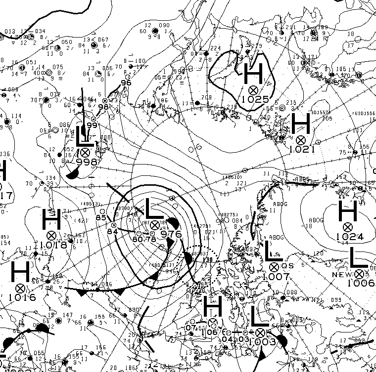
The MSLP of the current cyclone is now down to 976 hPA:
The latest WaveWatch III forecast has increased the predicted peak height and period of the resulting waves once again:
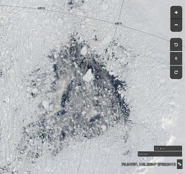
Large holes are appearing in the sea ice on the other side of the Arctic too. Take a look north of the Laptev Sea for example:
Meanwhile the current cyclone on the Pacific side of the North Pole appears to have bottomed out at 974 hPa:
Here’s the latest sea ice concentration one day delta map from Wipneus:
Despite the expected divergence caused by a low pressure area crossing the ice, both are and extent of sea ice on the Pacific side of the Arctic are still falling.
The waves are considerably smaller in the Beaufort Sea today, but not in the Bering Strait!
Here’s the latest one day delta map:
and here’s video showing the motion of sea ice in the Beaufort & Chukchi Seas so far this summer:
Here’s an animation from Wipneus revealing the effect of the two recent cyclones on the Pacific side, plus everything else that’s been going on in the Arctic:
Click the image to see a much larger (3.3 Mb) version.
AMSR2 Arctic sea ice extent has taken another tumble, and has dropped below 2016:
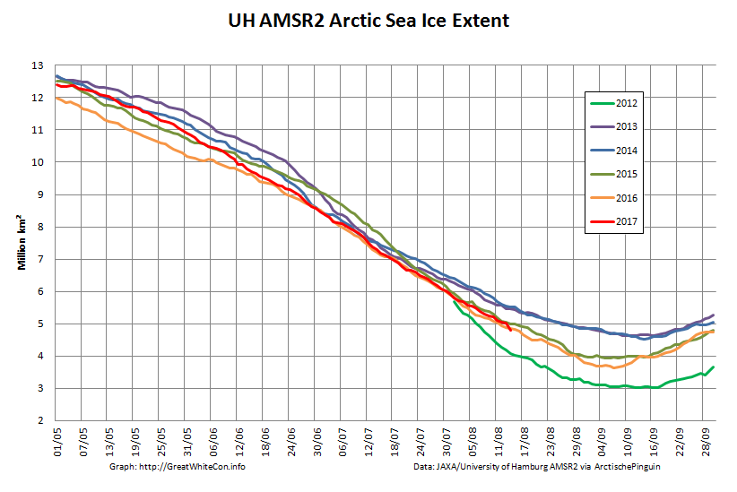
Only 2012 left to beat!
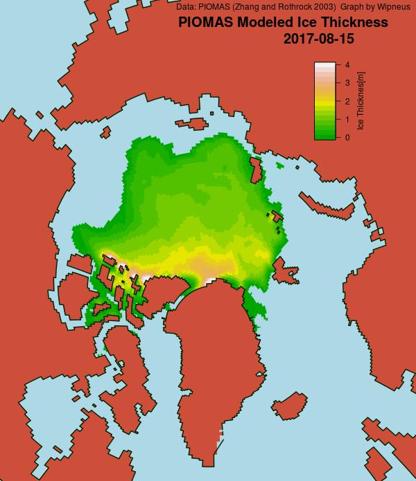
A PIOMAS mid month update has been released, including gridded thickness data. 2017 modelled volume has failed to follow 2012’s trajectory towards the September minimum, and is now on a par with 2011:
After a “brief hiatus” in the wake of the recent cyclones Arctic sea ice area has posted a new low for the year:

Extent has yet to follow suit:
The main loss of area has been in the “Beaufort Bite” once again:
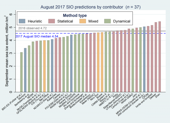
The SIPN August sea ice outlook has been released. Here are the predictions:
Watch this space!
Today’s WaveWatch III forecast for later today reveals increased height of the waves heading for the ice edge compared to yesterday:
Good info Jim, My analysis agrees. You would think Arctic Mission (AM) would of deseminated if up to speed since claiming NASA support which must be more rhetoric than fact. I see AM to date confirming PPPPPP suspicion until shown otherwise.
Plenty of prior planning (PPP for short) doesn’t help control the weather though Doug! Yesterday’s storm seems to have been kind towards Pen Howard’s Arctic Mission. See above.
Personally I doubt that will remain the case for the whole of the next 6 weeks or so!!
Amazing how unclear everything is even at this late date. Range of forecasts could still be up to 2 million sq K in 50 days.
Watching with interest but too scared to make a prediction as he who predicts is usually wrong with sea ice.
This is an unprecedented situation, since satellites started flying at least:
How the rest of the 2017 melting season plays out, after a not particularly warm summer followed an extremely warm winter, still remains to be seen!
For a slightly different perspective, the 5 day averaged NSIDC Arctic sea ice extent is tracking 2007, and slightly above 2012:
Nice Graph!
Thanks Jim, this is a very useful collection. One is puzzled by the combination of events as to how it will play out, with a bias towards it not being a new low. Psychologically speaking, once a year like 2012 happens, it becomes the new benchmark and distracts from the extremity of the big picture.
In my daily amateur checks of circulation on Nullschool (an addiction, I confess) I note all kinds of cyclonic activity outside the tropics. Antarctica is OT, but it might be interesting to see what that thing over by the Kuril Islands does. It’s got a powerful circulation and a tight eye, which is unusual for extratropicals. This is much too far south to be about the Arctic, but the northern Pacific has multiple gears/cogs and they do seem to be forcing some energy through the Bering Strait and even across land.
https://earth.nullschool.net/#current/wind/surface/level/overlay=temp/orthographic=192.25,53.13,466
I wish I had studied meteorology when my brain was young enough to retain a bit more … I don’t know if to be dismayed or excited by all this, well both I guess.
Note: confusing my reader; Kuril Islands are between Japan and Kamchatka (Russian peninsula), nowhere near Antarctica.
You did mention the “northern Pacific” Susan!
Thanks. Yes indeed Jim, but given I had to check a map to locate the Kuril Islands, I was overexplaining for anyone confused by linguistic proximity. We geography buffs don’t realize how many people are geographically challenged.
Your blog is wonderful!
You are very kind Susan.
There have certainly been previous occasions this year when weather systems have brought heat and moisture into the Arctic from the north Pacific. You may also be interested in this somewhat controversial paper that suggests that:
Is Arctic Ice Loss Driven by Natural Swings?
Finally got my round tuit and took a look. The extract you include above makes sense, but the exploitation of this information to formulate a specious argument is anti-human and disgusting.
My point is different. Since I starting watching weather patterns and circulation closely in the mid-oughts, they have radically changed, and are much wilder. Jennifer Francis discusses some of this.
My suggestion about the Pacific churn pushing up through and past the Bering Strait is that increasing chaos and extremes are adding a further stress on the whole system. It’s not “instead of” it’s “in addition to”.
I suspect you agree with me, but the emphasis in your always entertaining discussion seems to point away from this.
I’m not being polite; I value your elucidation in my scatterbrained way.
“Psychologically speaking, once a year like 2012 happens, it becomes the new benchmark and distracts from the extremity of the big picture.”
Exactly my sentiments as well, Susan. What happens I think is a new minimum is hit, which becomes the new benchmark from which to judge succeeding years, when in fact what should be looked at is the range of lows in recent years, i.e. the overall trend is to less ice. It’s not like we hit a new low then bounce back up to a consistently expected (no worries mate) range, but instead stay low until in some year 2012’s low is broken, then we start the whole process of using whatever year that is as a new benchmark to judge subsequent years. Then in say year 2021 people will say, “Oh, it wasn’t even as low as 2012.” Huh?!
The denialsphere did that with world temps post 1998, saying the world was cooling. Of course once 1998’s record was surpassed, no mention was made by the denialsphere about their cooling theory having been eviscerated and of a world warming further. It’s now likely post 2016 to them will be argued as a cooling world, i.e. until it’s surpassed.
Could not the High Benchmarks of the late 70’s be used for the same purpose??
Clearly accounts before Satellites, by experienced people on the ground in the early to mid 1900’s point to far less Arctic Ice than the high point in 79’…
Benchmarking by all time highs and lows works both ways..
[URL redacted – Mod]
You’re repeating yourself Phil.
1) What “High Benchmarks of the late 70’s” might those be?
2) Where’s your “mid 1900’s” evidence hiding?
Not here to argue, just a question.
Different blogs have reported that if we look at the Arctic ice extent on the 1st August in the period 2006-2017 we will notice a little growth, this, only if we use MAISE data. Vice versa, using SMRR-SSMIS ones the trend is clearly negative. Therefore, I’ve sent an email to the nsidc asking which one of the two data set is correct to be used in an analysis like that and their answer was the following one:
The point is: do we have to use MASIE or not?
Thanks for your collaboration,
Michele
p.s.: I still believe that the analysis has to be done looking at the big picture and not only daily, but my doubt remain the same.
[Reformatted slightly – Mod]
Welcome Michele,
I actually interviewed Walt Meier of NASA (and ex NSIDC) about that very question. Here’s what he told me:
DMI, MASIE and the Sea Ice Index – An Interview With Walt Meier
My summary of Walt’s words of wisdom:
To reiterate, anybody who shows you MASIE data whilst claiming that it reveals some sort of trend or change in trend of Arctic sea ice extent is desperately trying to pull the wool over your eyes.
Of course Arctic Ice has decreased since a high point in the 70’s… Meanwhile DMI shows an INCREASE in Greenland Ice Mass which corresponds with flat/decreased Sea Levels the past few years.
I agree the Poles are a bellwether for the Planet’s Temperature.. However, realistically we only have exact Sea Ice Data going back to 79… Too short of a time period to draw future conclusions, we are in a cycle… Again, Amundsen etc, showed a low point in Arctic Ice well before AGW Theory.. Then Ice GREW through the 70’s..
Overall, how much, if at all is Mankind affecting the Planet’s Temperature??
[URL redacted & spelling corrected – Mod]
I can probably guess, but you haven’t quoted your sources for the ludicrous statements you make. In brief:
1) DMI do NOT show an increase in Greenland ice mass.
2) Whilst the NSDIC’s sea ice index “gold standard” only goes back to late 1978 there are other sources of data. In particular “Amundsen etc.” do NOT show a low point in Arctic sea ice extent, and you seem to be sadly misinformed about the beginnings of “AGW Theory“.
3) Have you by any chance read the IPCC’s conclusions about “anthropogenic global warming”
Jim, I think you knew that Phil meant the “Surface Mass Budget” as reported by DMI. It is possible, though I don’t know for certain, that the Greenland ice sheet has grown this year. Just check the math and the facts. The increase in this year’s surface mass budget — about 500 Gt as of earlier this week — and the short, uneventful melt season mean that ablation and calving from glaciers and ice shelves would have had to increase substantially from average to offset that. Maybe that happened, but no one has identified such an increase. A helpful scientist probably will now.
Hi Michael,
If that’s what Phil meant then surely he should have said “Surface Mass Balance/Budget” and not “Greenland Ice Mass which corresponds with flat/decreased Sea Levels the past few years”?
This year’s SMB is around 150 Gt/year above “average”. That doesn’t seem to be enough to reverse the direction of the annual ice mass “loss of around 200 Gt/year over the last decade” reported by DMI?
Jim, given the melt season, do you think it somewhat likely, likely, or highly likely that ablation and calving increased to make up the melting “shortfall”? I don’t know, but I would think the overall melt season and calving (at least) are somewhat correlated. Also, the 350 Gt per year increase in the SMB you cite is the average from 1981 to 2010. Statistics aren’t easily found — if they are available — but it would seem reasonable that there has been a smaller annual increase in the SMB in recent years — even DMI seems to point that out. Therefore a recent average increase in the SMB would be lower than 350 Gt. But, let’s take the 200Gt overall loss as more or less accurate (keeping in mind Shepherd et al., from 2012, who argued that the “best” estimate of Greenland ice sheet oss from 1992 to 2011 was 142 plus or minus 49 Gt per year). So, if the recent average SMB change is anything less than 300 Gt (a safe bet?) and the average net loss is as high as 200 Gt, a 500 Gt increase this year would not have been offset and the ice sheet would have grown. Potentially by a lot, if Shepherd’s conclusions are accurate. More accessible annual data on this would be good. Whoever is gathering it seems to think it isn’t worthwhile making easily available. Keep an open mind, Jim, life is more interesting that way.
Well Michael, here’s a “new” island exposed for the first time in 2017 by calving of Kjer Gletscher:
Interesting?
So, why isn’t that the equivalent of saying there actually is no problem(to play devils advocate for 1 second here)?
Are you referring to what Walt Meier said about MASIE, which the NSIDC just reiterated to Michele?
If so the problem is that lots of “skeptical” types insist on using that data for purposes which the data provider has explicitly deprecated.
Michele/angech – You may find this illuminating? I expect Phil is familiar with the way the game works.
The “Watts Up With That” blog has just published an article extolling the virtues of MASIE data, under the title:
“Arctic melt season changes and the Arctic regime shift”
I just commented on it as follows:
Would you care to hazard a guess concerning when my comment will become visible to the vast flock of WUWT watchers?
A new day has dawned, but my helpful hint to the WUWTers remains invisible. However during my vain search I did stumble across this little gem from Valaker:
Never?
None the less 7 other people have been allowed to comment more or less along the lines that you have iterated.
I feel Walt is wrong to assert it should not be used and you are not being fair in considering its use
Perhaps you could put in a good word for me at WUWT then angech? Here’s where it’s hiding:
If 7 other people have been permitted to post a similar comment then why not yours truly?
Your feelings are more relevant than Walt Meier’s vast experience in these matters? Surely you jest?!
“If 7 other people have been permitted to post a similar comment then why not yours truly?”
It is a mystery in some ways.
I feel I will leave it up to your and the moderator to sort out, the only good word I could put in is that all blogs are helped by adversarial opinion [different to comments unfortunately].
I understand the value Walt’s opinion gives your viewpoint. It does not make the matter fair no matter how vast his experience. If only the importance of the issue was not so great for you then different weightings might be able to be discussed.
Thanks for putting up the post, It takes a great deal of effort which is appreciated even from the other side of the fence.
Thank you for your kind words angech, but it’s not Walt’s “opinion”, expert or otherwise. It’s a fact that:
Anthony and the WUWT mods have firmly blocked all the usual channels of communication. What is a poor girl to do in such circumstances?
Shock News! The “moderator” at WUWT has finally released my helpful comment from purgatory!!
Something has been lost in translation though:
No “rebound” yet following the passage of the recent storm. Here’s today’s one day AMSR2 concentration delta map:
Note also the pink areas indicating reducing sea ice concentration around the North Pole.
Whilst sea ice area north of the Chukchi Sea has recovered slightly, the decline in the Beaufort Sea and the CAB north thereof continues:
For yet another perspective on Arctic sea ice extent, the JAXA 2 day averaged metric took a post storm tumble yesterday:
Nice graph!
I think OBuoy #14 is actually surrounded by newish ice — IIRC it was floating in very open water last year until M’Clure strait refroze.
Hi Allan – Have you seen this image before?
Anyone genuinely interested in getting a quick overview of the history of Arctic sea ice should avail themselves of the plethora of information freely accessible on this site hosted by the Woods Hole Oceanographic Institution…
http://www.whoi.edu/website/beaufortgyre/home
The “History” tab should be of particular interest to those making claims about cycles and “High Benchmarks of the late 70’s”.
Similarly, those interested in learning about the background to AGW in general could, in addition to the links already provided by Jim, do far worse than perusing the seminal work of Spencer Weart. This is freely available on the following site, which is hosted by the American Institute of Physics…
https://history.aip.org/climate/index.htm
As for the claim about “flat/decreased Sea Levels the past few years”, it is worth looking at the data available on the NASA “Vital Signs” site in order to see how this claim represents cherry picking at its most egregious …
https://climate.nasa.gov/vital-signs/sea-level/
On the other hand, those with a closed mind might prefer to stick to those sites which pamper to their own beliefs, and reinforce their own misconceptions.
[Graphs embedded – Mod]
Hi Bill,
Thanks very much for your always valuable input. Spencer Weart is worth reading from cover to cover for anybody genuinely interested in assessing the “climate change” evidence.
I was also wondering if you had any (publishable!) thoughts you might wish to share about the recent firestorm over at Neven’s place?
I’ll grant you this isn’t a plot of sea ice but it does show that although temperatures have warmed significantly at Barrow, AK since oh right about the start of the satellite sea ice data, the temperature departures from average are now about the same as they were in the 1920’s. Its not a stretch to think sea ice would follow a similar trend – yes?
http://nsidc.org/arcticseaicenews/files/1999/06/cumulative-anomaly.png
Not really, no. Utqiaġvik (AKA Barrow) is one, not necessarily typical, point in a very large Arctic.
In addition that’s a cumulative anomaly plot so it’s not at all clear to me that it shows what you appear to think it shows.
Rather than you being a clairvoyant about what I think it shows, let’s quote the explanation by NSIDC:
” It is instructive to look at the cumulative temperature departure from average for Barrow, Alaska (Figure 4c). From 1921 until about 1989, conditions at Barrow actually got progressively cooler. However, since that time, temperatures have markedly increased.”
Do you have a problem with their interpretation?
Trying to read other people’s minds is fraught with difficulty!
I don’t have a problem with the NSIDC’s interpretation. What do you think the relevance is to Arctic wide sea ice “coverage”?
Here’s the rest of the paragraph you quoted from the NSIDC’s June 2017 Arctic Sea Ice News:
and this is the graph in question:
Those interested in the progression of temperatures across the Arctic region as a whole, rather than from a single station, might care to look at the 2016 Arctic Report Card complied for NOAA’s Arctic Program.
http://www.arctic.noaa.gov/Report-Card/Report-Card-2016
The tab marked “Surface Air Temperature” has graph which outlines overall trends in surface temperatures from 1900 onward for land stations located north of 60N.
It was postulated above that “Its not a stretch to think sea ice would follow a similar trend – yes?” [i.e. similar to the temperature trend]
That being the case, which would the response of the sea ice be more likely to follow: overall Arctic temperature trends, or the trend from a single location?
[Embedded the image – Mod]
“Surface Air Temperature” has graph which outlines overall trends in surface temperatures from 1900 onward for land stations located north of 60N.
That is not exactly 80N now , is it.
Does London fit in there?
angech – How many land stations are there north of 80 degrees?
You may wish to take a look at this article?
https://greatWhiteCon.info/2017/07/reanalysis-of-arctic-climate/
which contains this graph, amongst others:
No, only lat 51. St Petersberg is 59 lat.
Helsinki and Espoo get in as cities
It appears that some here are perhaps less than fully familiar with the geography of the various bodies of water which, taken together, comprise the total area in which Arctic sea ice exists.
The 60N parallel cuts through the following seasonally ice covered areas…
Sea of Okhotsk
Bering Sea
Hudson Bay
Labrador Sea
Greenland Sea
I have no idea what relevance there is in the latitude of London – which happens to be about 51 degrees 30 minutes North – but those with any knowledge about Arctic sea ice will undoubtedly be aware that ice in the region of Newfoundland Island, Nova Scotia and the St Lawrence reaches down as far as the mid-40’s.
In other words, one gets Arctic sea ice at latitudes roughly akin to those of the south of France or the north of Spain.
Nice to see you commenting here, Bill.
I am definitely less familiar with the geography than yourself.
The relevance there is in the latitude of London was to do with Jim putting up a 60 latitude and North figure of warmth which was a felt a little below the belt for a true Arctic discussion.
80 N is an often quoted temperature region and I was surprised to see something 20 degrees lower.
In my naivety I imagined that that might be as low as London.
Obviously wrong.
Land stations have little to no practical relevance to Arctic ice volume and extent discussion in my opinion, which can be wrong.
On the topic of sea ice extent beyond the satellite record, perhaps this paper may be of interest:
Re-calibration of Arctic sea ice extent datasets using Arctic surface air temperature records. Hydrological Sciences Journal, Volume 62, 2017 – Issue 8
http://www.tandfonline.com/doi/full/10.1080/02626667.2017.1324974
Was it this conclusion you wanted to highlight?
Conservatively speaking Jim, if I were allowed to play devils advocate for a second, looking at the sattelite side of that graphic and taking into account the error values one could be forgiven for saying that the denialist camp is certainly not going away anytime soon as they have a case for questioning the relevance of the numbers.
That is to say if that graphic was the only one making the case, of course.(!??!)
May I ask where that graphic comes from?
(..I take it that graphic only reflected maximum values for sea ice in the Arctic?!!?)
((… thus the trend toward sea ice extinction in the Arctic is less convincing!!))
It comes from the paper referenced by nvw, authored by Connolly Sr., Connolly Jr. and a certain Willie Wei-Hock Soon:
How about this one instead, from the Arctic Sea Ice Blog?
or this one from the NSIDC:
However, if we also consider the full envelope of the associated confidence intervals, we cannot rule out the possibility that similarly low sea ice extents occurred during the 20th century. That is, the upper bounds of the estimates for all years since 2004 are still greater than the lower bounds for several years in the early 20th century.
<<
Ok, yeh a sceptic paper: I wasn't reading the context of your response: thanks!
..the neven link didn’t work btw!
Now fixed. Thanks for the heads up!
..thanks for showing the graphs: I must be trigger happy!
Great blog !
I think the parameters are all wrong in the way people judge the Arctic icepack, using northern hemisphere ice assessments.
I think the total amount of ice in the Arctic Ocean is among the worst, if not the worst state on record. The Arctic icepack is the thing that Wadhams says is going to collapse in coming years. Thick ice, or the “bits of ice left stuck to land” as Wadhams puts it, and the CAA are not really part of what Wadhams is talking about.
See my explanation here —> https://forum.arctic-sea-ice.net/index.php?topic=119.msg126019#msg126019
Thanks for your kind words Tommy.
However if you scroll up a bit you’ll note that, according to PIOMAS at least, “the total amount of ice in the Arctic Ocean” is now well above 2012 levels.
Hi Jim, I think you mean the graph that includes the CAA and “thick ice stuck to land”.
The Man agrees 🙂 —> https://forum.arctic-sea-ice.net/index.php/topic,119.msg126193.html#msg126193
I have had several conversations with “The Man” you refer to over the years. He’s a very nice chap, but I’m afraid the words of his you quote support my statement above rather better than they do yours on the ASIF!
No they don’t at all. You are completely off. His statement is VERY clear in support of what I said. You have read it through your own stubborn old man glasses. Like all the rest of the clowns on the Arctic Forum, still arguing over minutia that no actual scientists thinks is remotely relevant. It’s the OCEAN that counts dumbo. No f.o. Goodbye.
Bye Tommy.
Let me break it down for you:
“”Dear Mr Barlow, Thanks for the link to the Arctic Sea Ice Forum. I see my name was taken in vain there””
That’s an inside joke, too long to explain here.
“”but it does roughly correspond to what I have been saying.””
That means ‘what he has been saying, roughly corresponds to what I said’.
“The gist seems to be…”
The rest of it is about northern hemisphere sea-ice, so not about the main bulk of the Arctic Ocean, which is what my post was about.
… and he finishes:
“”(will bring delight to climate change deniers)””
This is why when I see a climate-science denier blurt out something like “Arctic ice is up from recent years”, I tell them “Arctic Ocean ice volume is in the worst state it has ever been.”
I’m not sure why you choose to persist with this Tommy, especially after apparently leaving in a huff. Since you insist, let me break it down for you.
First off you’d better explain the “inside joke” in more detail. It sounds like typical dry British humour to me:
https://www.collinsdictionary.com/dictionary/english/take-someones-name-in-vain
Do you get the gist?
By my reading The Man’s “roughly correspond” roughly corresponds to the gist of the ASIF in general and that thread in particular. What’s your reading of this paragraph again?
“”First off you’d better explain the ‘inside joke’ in more detail. It sounds like typical dry British humour to me””
It means treating him like a God. It’s a double-entendre.
– take someone’s name in vain in British –
b. humorous to say (someone’s) name
“”What’s your reading of this paragraph again?
‘On the theme of volume being the important parameter, the PIOMAS through-the-year volume maps show how 2017 has had by far the lowest ice volume ever, right from January until June when it has staged enough of a recovery to take it above 2012.’
He has changed the subject, and is now talking about the whole of the N. Hemisphere sea-ice. A different topic than the Arctic Ocean.
“Roughly corresponds” means ‘roughly corresponds’.
I think a lot of people on Arctic Forum are a bit backwards on this one. You’re analysis of the above paragraph shows you have a blind spot. They haven’t thought it through, and are OCD on charts and graphs, linear thinking instead of lateral (linear+lateral).
The Arctic Ocean looks like it is in the worst shape on record (apart from thick ice, crushed up against land — “Bits of ice stuck to land” as Wadhams once put it in a video, re. Blue Ocean event — and ignore CAA and other peripherals.
Theoretically, Arctic Ocean could one day mostly shatter and break up, but it is still possible people could STILL be unable to sail the NW passage.
The overall state of the Arctic Ocean is all that matters.
To me, http://ocean.dmi.dk/arctic/sie_monthmean.uk.php , this seems like a fair statistical set to follow. (Is it?)
It says, IMHO, that the first half of the year hasn’t changed much, but the second half only changes wildly around August, leaving the rest largely (relatively speaking) untouched.
Thus- I am very keen to see the updated chart giving the number for August 2017.
I would also note that the DMI temp graph for 80N seems to have a very good relationship with reality: it basically told us it was not overly hot for the whole melt season, and more consequently leading into it, and that was visually confirmed by all the clouds in worldview.
The temp spikes for late 2016 and early 2017 seem to be corroborated by volume models,…. but I suppose the point is you can’t corroborate via model: so maybe the idea of temperature spikes in the dmi 80N temperature graph have to be corroborated another way?
** Hence the global need for excellent multi-year sea ice statistics, IMHO!
(I skipped the 80s and early-mid 90s to conservatively observe the dmi monthly extent chart, btw, and thus draw my conclusions/rough opinion!)
..make that: September and October aswell!!
(I like the new records for those months but even without there are more significant drops than the early months!)
This graph excludes the “peripheral” seas:
It’s evident that the inter-annual spread does indeed increase as the September minimum approaches.
“it basically told us it was not overly hot for the whole melt season”
or maybe it told us that sea ice extent north of 80 was relatively high.
Fingers crossed. The graph has to go down or up quickly soon. It cannot stay flat at its current level, can it?
The high res AMSR2 graph is still heading down: