Stung by some unusually constructive criticism from Anthony Watts we have (somewhat hurriedly) added several new pages to the Great White Con “Resources” section of this web site. They contain the sort of information that is rather tricky to update automatically on a daily basis, and concentrate on resources that help the interested searcher after truth get a handle on the thickness and hence volume of the sea ice in the Arctic, on a regional as well as pan Arctic scale.
The first section is entitled “Arctic Sea Ice Graphs“, and here’s an example of one graph which reveals the ice volume in various regions of the Arctic, based on the output of the PIOMAS model:
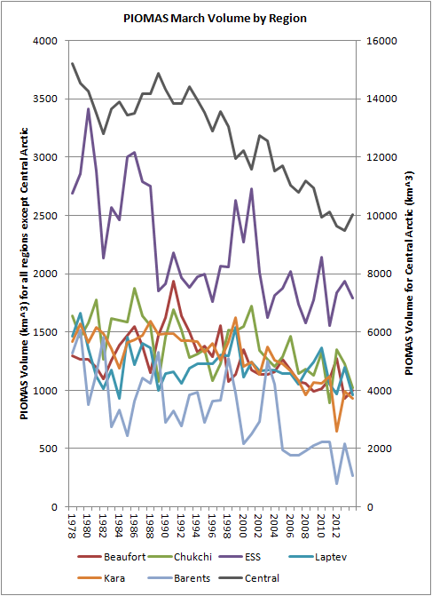
[Graph by Chris Reynolds on the Dosbat blog]
The second section is entitled “Ice Mass Balance Buoys“. As the name hopefully suggests, this section displays data reported by the Cold Regions Research and Engineering Laboratory’s currently active ice mass balance buoys in a variety of novel formats. These buoys are deployed on a regular basis at selected locations across the Arctic, and report on a number of different parameters including snow depth, ice thickness and temperature. By way of example here’s a couple of reports from IMB 2013F, which was originally deployed last August on what was then classified as “first year” ice in the Beaufort Sea. First of all here’s the Google Maps/Earth view that reveals how the buoy has moved around the Arctic since then, and shows how clicking on one of the “pushpins” reveals the values of a variety of interesting metrics on a daily basis:

As you can see, last August the thickness of the ice floe that the buoy is located upon was 1.4 metres thick. If you click through to the live map and experiment you will discover, amongst a variety of other things, that the ice under the buoy is now 1.68 meters thick, with an additional 49 cm of snow on top of that.
A second set of images shows graphs revealing the temperature above, below and within the ice, currently on a monthly basis:
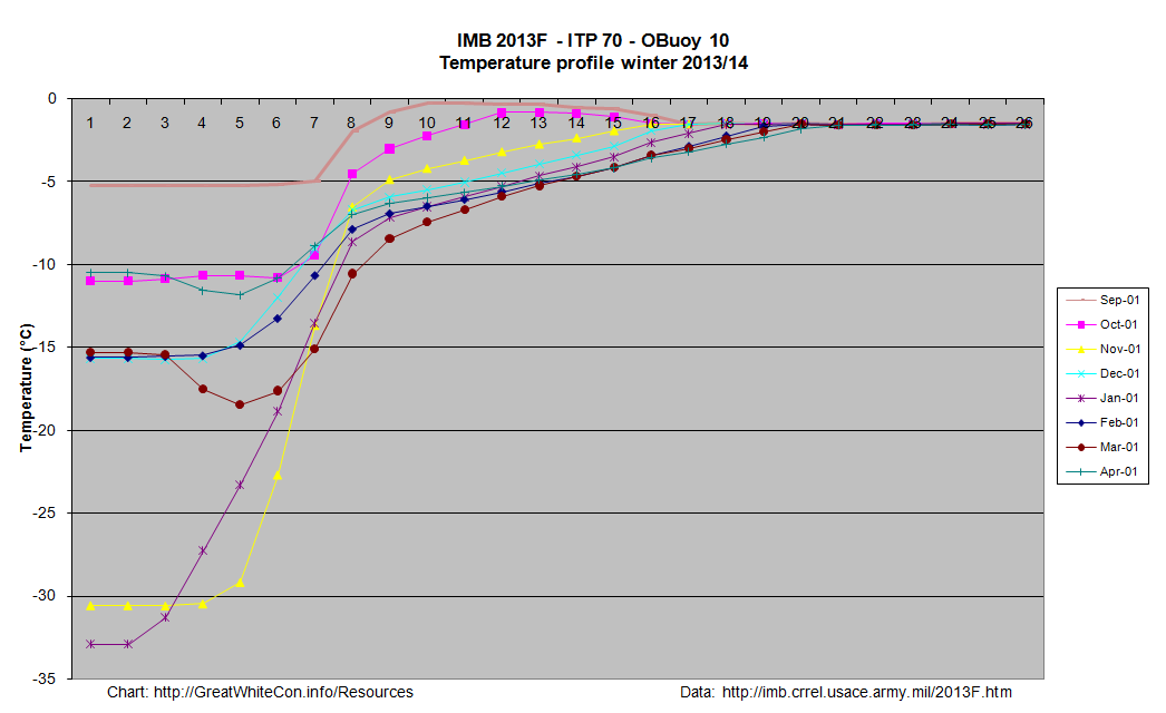
Click on the graph to view a larger version. This one requires a certain amount of interpretation, but the first thing to note is that the numbers across the top represent the position of thermistors spaced 10 cm apart on a pole that is mounted vertically through the ice floe. Number 1 is in the air above the floe, the rightmost side of the graph (number 26 in this case) is in the water below the ice floe, and somewhere in between those extremes the temperature sensors can also be in the midst of either ice or snow.
At the end of March the interface between ice and snow in this case was somewhere between sensors 8 and 9, and hence at a temperature of around – 7 degrees Celsius, by which time the buoy had moved from the Canadian waters where it started into the area of the Beaufort Sea north of Alaska.
For further discussion about the interpretation of our new resources please use the comment section on the “About Our Arctic Sea Ice Resources” page. For technical observations and suggestions for improvements feel free to comment below!
jim,
very nice effort on the buoy data. it is under-utilized in many Arctic sea ice discussions. in fact i don’t see the buoy-researchers themselves doing a whole lot with their data.
some suggestions:
— move the 10 cm marker line above the graph itself.
— plenty of room to illustrate the IMB stack in lower right corner.
— mabe rotate graph 90 so more intuitive agreement with imb device.
— provide the freezing point of sea water — this is your asymptote on the right for all time series under ice
— animate daily data slowly instead of all these confused colors — easy to do, screenshots from excel line graphs.
— mark up daily air, snow, ice water boundaries before animation, colors easy to do.
— note internal ice gradient fully determined by heat equation with air and water boundary conditions.
— at equilibrium solution to heat eqtn gives the linear gradient you see within the ice
— many available animations of heat equations
— discuss bad readings in buoy data and how to recognize them
— drift seems utterly inconsequential over this time frame
— so few point buoys, so big a basin: what are we learning overall?
— is buoy data actually used to calibrate or validate icebridge or piomas?
— is buoy data actually consistent with other ice measurements, or is their pixel scale too many km^2?
Hi Tom,
Thanks very much for your comprehensive feedback! Don Perovich has certainly published some work on the ice mass balance buoys, and there’s this overview of the famously long lived 2006C on the CRREL site, from which I reproduce this image.
I take it that sort of thing is more what you had in mind?
The temperature profiles were produced manually in something of hurry by a non expert Excel user (i.e. yours truly). Once all the “user feedback” has been assimilated I shall endeavour to automate the whole process on *IX instead of Windoze.
I’m not sure what you meant by “drift seems utterly inconsequential over this time frame”. Can you elucidate further?
jim,
thanks for those new resources. the one with colors could use a little explanation of the depth scale — why sea level is not fixed (negative top depths), not melt ponds since there is still snow. it seems the buoys are not recording surface albedo nor snow thermal conductivity (dry, wet, loose, packed).
when the buoys stay within a small region, we don’t get any overall picture either of Arctic Ocean overall conditions or of how bulk ice is moving. the buoys are just points, ice cover is 2D area. drift data give a=a handful of historic flow lines but it’s not known whether these are representative of overall ice movement.
below is a totally remarkable effort to display global surface wind flow. in the Arctic, that is largely driving ice flow. note you can choose wind at various heights hPa and color by local temperature etc. sort of like having an array of millions of buoys
http://earth.nullschool.net/#2014/04/15/2100Z/wind/surface/level/orthographic=-92.32,68.05,772
Hi Tom,
Thanks for the additional feedback. I now see what you mean about the IMBs giving an inadequate picture of ice drift in the Arctic as a whole. There are also other buoys that report their position of course, such as the Ice Tethered Profilers.
The US Navy’s ACNFS model provides thickness and drift nowcasts and forecasts, but CICE is of course just a model, not actual measurements:
Maybe some of CICE’s deficiencies have been addressed in the new version 5, but as far as I am aware the Navy is still using version 4. I have been experimenting with it myself, but a lot of work remains to be done before anything like the “Earth” wind map will be feasible. I am already familiar with Cameron‘s work. Here’s the “Arctic cyclone” forecast for 00:00 UTC on Friday, preserved for posterity:
The cracks in the ice near the NP are much more interesting if you compare the day to day movement over the past week with the movement in the same area last year at the same time. With clear skies in both weeks, and very distinct ice floes it appears that the rate of movement south is much faster this year than last year.
The ice floes this year are also much more broken up this year suggesting a faster melt out in this are.