Much like yesterday I was idly browsing my Twitter feed this morning whilst simultaneously consuming my habitual Sunday coffee + BLT when news reached me that David Rose had published yet another article in the Mail on Sunday that purports to investigate “climate science”:
Perhaps due to all our sterling work here at the Great White Con extracting the Michael, it doesn’t seem to fall under the Mail’s “Great Green Con” banner anymore. The general drift is the same though, apart from that lurid title of course!
I think current ‘renewable’ sources such as wind and ‘biomass’ are ruinously expensive and totally futile. They will never be able to achieve their stated goal of slowing the rate of warming and are not worth the billions being paid by UK consumers to subsidise them.
Skipping over all the (merely rhetorical?) self-pity, let’s move on to the climate science, such as it is!
Last Monday… a Met Office press release stated: ‘2014 one of the warmest years on record globally’.
The previous week, almost every broadcaster and newspaper in the world had screamed that 2014 was emphatically The Hottest Year Ever. They did so because NASA told them so. Its Goddard Institute for Space Studies (GISS), the custodian of one of the main American temperature datasets, had announced: ‘The year 2014 ranks as Earth’s warmest since 1880.’ If you’d bothered to click on the sixth of a series of internet links listed at the end of the press release, you could have found deep within it the startling fact that GISS was only ’38 per confident’ that 2014 really did set a record.
In other words, it was 62 per cent confident that it wasn’t. Another detail was that the ‘record’ was set by just two hundredths of a degree. The margin of error was five times bigger. These boring details were ignored. The ‘2014 was a record’ claim went to the very top. President Obama cited it in his State of the Union address. Like the news outlets, it’s unlikely he will issue a correction or clarification any time soon.
Al Gore repeatedly suggested that the Arctic would likely be ice-free in summer by 2014. In fact Arctic ice has recovered in the past two years, and while the long term trend is down, it looks likely to last several more decades.
Unfortunately that is misleading and/or inaccurate, apart from the bit about the long term trend in Arctic sea ice. Hence I’ve just popped yet another Dear John (and Poppy) virtual letter to Mr. Rose’s managing editor (+PA) at the Mail on Sunday, and I’ll have yet another long chat with IPSO tomorrow:
Us:
Dear John/Poppy,
Would you believe that David Rose is at it again? Not only is he “interviewing” himself in your esteemed organ today, he is misrepresenting the underlying science yet again.
I really must insist that whoever owns the desk on which the buck currently stops for the following article starts communicating with me yesterday if not sooner:
I am away from the office until Tuesday, February 10. I will be checking emails occasionally but if your message is urgent, please contact my assistant Poppy Swann.
Ultimately followed by:
Dear Jim
If you have a complaint about last Sunday’s article, you should set out exactly what it is. If you disagree with any opinions expressed you are welcome to write a letter that we will consider for publication.
You mention that you have sent us a number of inquiries recently. The only other, to my knowledge is that you wanted to know the source of some data that David Rose mentioned in an article some months ago. David Rose told me it came from the official website. Perhaps my colleague Poppy Hall can find it for you since David is probably unwilling to help after your insult.
Best regards
John
Us:
Dear Poppy (and John)
Please would you ask David to let me know where exactly, and on which “official website”, he obtained the DMI extent numbers he quoted in his article last Summer?
FYI John, at Poppy’s suggestion I have also emailed the editorial team @MailOnline. They have yet to even acknowledge receipt of my email of January 26th.
I was idly scrolling through my Twitter feed this morning when I couldn’t help but notice that Gavin Schmidt, Director of NASA’s Goddard Institute for Space Studies, was calling for volunteers to research possible trends in The Economist’s attitude to “climate change” over recent decades:
Interesting media analysis topic for someone with more time than me! (4/4) @TheEconomist
— Gavin Schmidt (@ClimateOfGavin) January 30, 2015
Unable to resist temptation I immediately popped on over to The Economist online and searched for the term “Arctic”, as is my wont. Lo and behold I discovered much to my amazement that they had published an article on that very topic earlier on this very day. However after reading it I have to say I was less than impressed, and reported my findings back to @ClimateOfGavin. I also called The Economist’s “Editorial” number, and spoke to a nice lady with an American accent who told me that she was an “answering service” and assured me that she would pass on my message to an Economist editor, but they almost certainly wouldn’t look at it until Monday. Here’s how the conversation is going:
Them:
The Northern Sea Route is not living up to the hype, either. In 2013 71 ships traversed Russia’s Arctic, according to the Northern Sea Route Information Office: a large increase since 2010, when the number was just four. But 16,000 ships passed through the Suez Canal in 2013, so the northern route is not starting to compete. In 2014 traffic fell to 53 ships, only four of which sailed from Asia and docked in Europe (the rest went from one Russian port to another). The route does not yet link Europe and East Asia.
The decline in 2014 was partly caused by the weather: less sea ice melted last summer than in 2013, so the route was more dangerous.
Now I distinctly recall posting this image:
on the Arctic Sea Ice Forum on August 23rd last year. Over and above that, here’s a couple of freshly minted videos to illustrate the point more vividly. The AMSR2 Arctic sea ice concentration data displayed is courtesy of the University of Hamburg:
[Edit 02/02/15] The Economist’s “man in Tromso” asked to see 2012 as well, so here it is. AMSR2 data wasn’t available in 2012, so this one uses the SSMIS passive microwave radiometer instead:
Set the top two running in sync and then if the difference between 2013 and 2014 isn’t as plain as day to you, my name is Snow White!
[Edit 05/02/15]
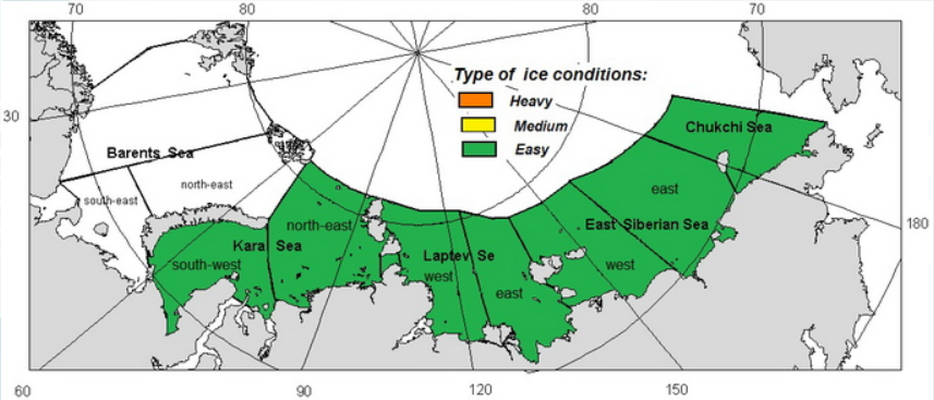
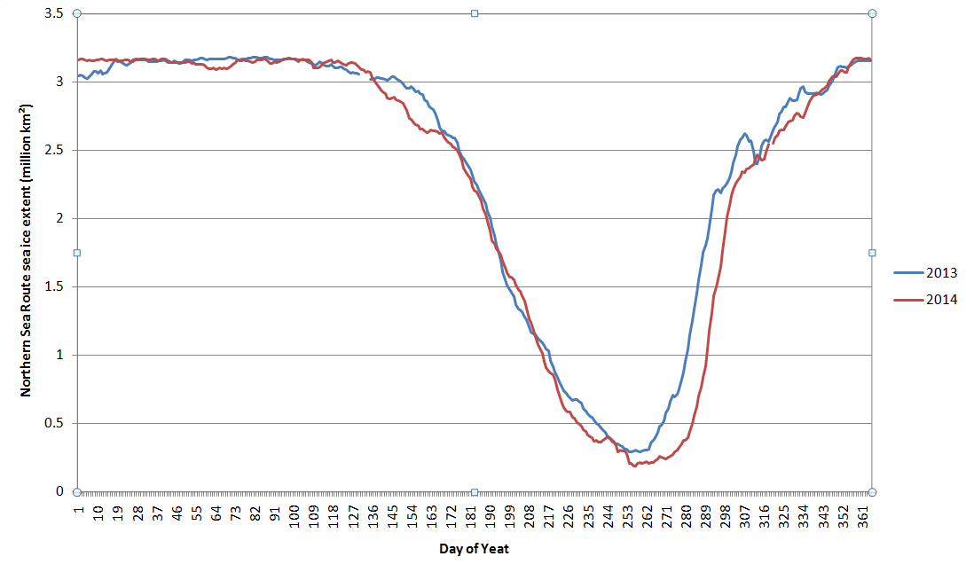
In an endeavour to quantify the reduction in ice coverage in 2014 compared to 2013 that’s evident in the animations we’ve combined the regional extents for the Chukchi, East Siberian, Laptev and Kara Seas to produce this chart:
[/Edit]
Hence:
Us:
Please forgive my rather brusque manner, but I arrive fresh from hauling the Mail on Sunday in front of IPSO.
Can The Economist provide some evidence for their rather vague assertion that “less [Arctic] sea ice melted last summer than in 2013”. Can you for example provide a link to an authoritative source?
The latest print edition of The Economist landed on my doormat this morning. I eagerly turned to the “Letters” section, but was disappointed to discover that my virtual “Letter to the editor” sent on Thursday morning must have missed their deadline. Here it is:
CC: Your “Tromso correspondent”
Sir(s),
I read with much interest the “Not so cool” article in your January 31st edition, which suggested “The hype over the Arctic recedes, along with the summer ice”.
I take the point your Tromso correspondent makes that “The Northern Sea Route is not living up to the hype, either”, but I must take issue with the hype that currently reads, in both your print and online editions:
“The decline in 2014 was partly caused by the weather: less sea ice melted last summer than in 2013, so the route was more dangerous.”
All the evidence I have seen (collected together for your edification, including maps, graphs and animations, at https://greatWhiteCon.info/2015/01/is-the-economist-being-economical-with-the-truth-about-arctic-sea-ice/) refutes that statement. The minimum Arctic sea ice area and extent in summer 2014 were both below 2013. According to assorted satellites there was significantly less sea ice bobbing about along the Northern Sea Route in 2014 than in 2013. The official August 2014 forecast published by the Northern Sea Route Information Office maintained that ice conditions would be “Easy” over the entire NSR.
I look forward to seeing this particular piece of “hype” receding in both physical and virtual print in the very near future.
I don’t usually get involved in debates about “the global warming pause”, but as you will eventually see there is an Arctic connection, so please bear with me. Personally I reckon “global heat” is more relevant than “global surface temperature”, but nevertheless NASA and NOAA issued a “news release” a couple of days ago stating that:
The year 2014 ranks as Earth’s warmest since 1880, according to two separate analyses by NASA and National Oceanic and Atmospheric Administration (NOAA) scientists.
The 10 warmest years in the instrumental record, with the exception of 1998, have now occurred since 2000. This trend continues a long-term warming of the planet, according to an analysis of surface temperature measurements by scientists at NASA’s Goddard Institute of Space Studies (GISS) in New York.
In an independent analysis of the raw data, also released Friday, NOAA scientists also found 2014 to be the warmest on record.
The announcement was accompanied by this video:
I figured our old friend David Rose would have something to say about all that in the Mail on Sunday, and I was not disappointed. Yesterday David reported, in bold headlines:
Nasa climate scientists: We said 2014 was the warmest year on record… but we’re only 38% sure we were right
Nasa’s Goddard Institute for Space Studies claimed its analysis of world temperatures showed ‘2014 was the warmest year on record’
But it emerged that GISS’s analysis is subject to a margin of error
Nasa admits this means it is far from certain that 2014 set a record at all
David Rose includes this NASA video in the online version of his article:
which finishes up showing the Arctic blanketed in red for the period 2010-14. In the body of the article David suggests that:
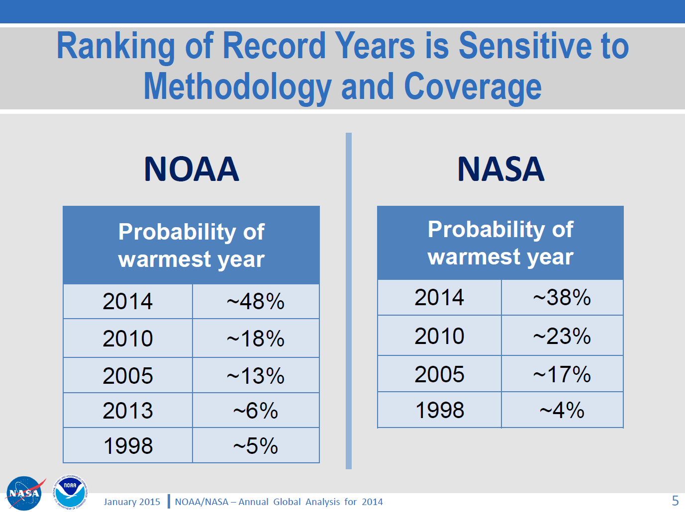
GISS’s director Gavin Schmidt has now admitted Nasa thinks the likelihood that 2014 was the warmest year since 1880 is just 38 per cent.
but for some strange reason David neglects to mention this NASA/NOAA “press briefing“, which includes the following figure:
As you can see and hear, Gavin Schmidt’s “admission” was pretty public, and available for anyone doing their due diligence on this thorny topic to see well before the Mail on Sunday published David Rose’s article. For still more from Gavin see also the second half of yet another video from NASA, which we’ve hastily made embeddable from YouTube since NASA’s Goddard Space Flight Center don’t seem to have done so themselves as yet:
[Edit – 23/01/2015]
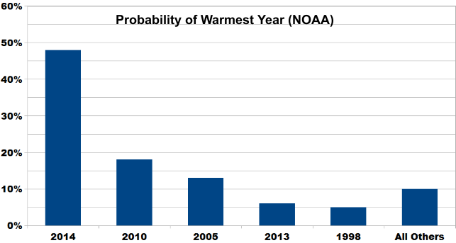
By way of further elucidation of the NASA/NOAA table of probabilities above, here’s a new graphic courtesy of Skeptical Science:
The probability of 2014 being the warmest year (due to margin of uncertainty and the small differences between years) is almost ten times that of 1998. And the contrarians were very certain that year was warm!
Does that help make things clearer, for those who evidently have difficulty understanding statistics?
[/Edit]
I also figured that the likes of “Steve Goddard” and Anthony Watts would be jumping on the same bandwagon, so you can imagine my disappointment when I discovered that they have both, unlike Gavin, blocked me from their Twitter feeds! Venturing over to the so called “Real Science” blog instead I discovered that Steve/Tony does at least read Gavin’s Twitter feed, although apparently not NASA/NOAA press briefings:
Them:
Implausible Deniability
Gavin is playing his usual game, trying to cover his ass with “uncertainty” that wasn’t mentioned in the NASA press release.
They get the propaganda out there for the White House and major news outlets, then try to generate implausible deniability through back channels like twitter. None of this was mentioned in the NASA press release.
Us:
I take it you weren’t on the call either Tony? Have you by any chance seen this press briefing?
THE DATA ON WEATHER AND CLIMATE (NASA AND NOAA) CAN BE COMPARED TO THE STOCK MARKET ON WALL STREET, MUCH CORRUPTION AND ALTERING. WE ARE NOT GUARANTEED A CERTAIN TEMPERATURE EVERYDAY; ALTHOUGH, THAT IS WHAT THEY WOULD HAVE US THINK, JUST BECAUSE OF SEASONS IN GENERAL.
Further to previous correspondence on similar matters, on January 27th 2015 I received the following email from the Personal Assistant to John Wellington, David Rose’s managing editor at the Mail on Sunday:
Dear Jim,
Thank you for your email.
I am afraid the best person to deal with your question is John Wellington who will reply on his return at the beginning of March.
Thank you for your patience.
Kind regards
Poppy Hall
Us:
CC: IPSO.co.uk
Dear Poppy,
Thanks for that information, but I am afraid my almost infinite patience in this matter is exhausted.
In John’s absence perhaps I might reiterate a question posed by Bob Ward of The Grantham Institute on Twitter yesterday:
Predictable that Mail on Sunday censored all letters pointing out errors in last week's article by @DavidRoseUK about @NASAGISS
Please would you ask whoever owns the desk on which the buck currently stops for the article entitled “Nasa climate scientists: We said 2014 was the warmest year on record… but we’re only 38% sure we were right” by David Rose to communicate with me as soon as possible. FYI – Here it is:
As I’m sure you must realise by now, unfortunately it includes some inaccurate and/or misleading statements which as far as I can ascertain have still not been publicly corrected.
Best wishes,
Jim Hunt
Post Script:
Bob Ward lodged a formal complaint with the Independent Press Standards Organisation about the Mail on Sunday article. Their conclusion?
The complaint was not upheld.
Remedial Action Required – N/A
Date complaint received: 13/02/2015
Date decision issued: 22/06/2015
Their “reasoning”?
The Committee noted that information about the margin of error had been made available by GISS, but that it was not in dispute that these details had been omitted from the press release. The article had made clear that this specifically was the basis for its criticism of Nasa, and the newspaper was entitled to present its view that this omission represented a failure on the part of the organisation. While the information had been released by Nasa, it had been released to a limited selection of people, in comparison to those who would have had access to the press release, and had not been publicised to the same level as the information in the release. The press briefing images referred to by the complainant were available on Nasa’s website, but were not signposted by the press release. In this context, it was not misleading to report that the information relating to the margin of error had emerged in circumstances where the position was not made clear in the press release. While these details of the margin of error may have been noted in a press briefing two days previously, rather than “yesterday”, as reported, this discrepancy did not represent a significant inaccuracy requiring correction under the terms of the Code.
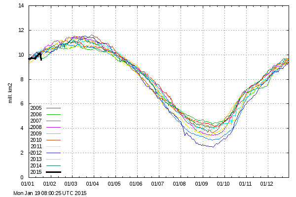
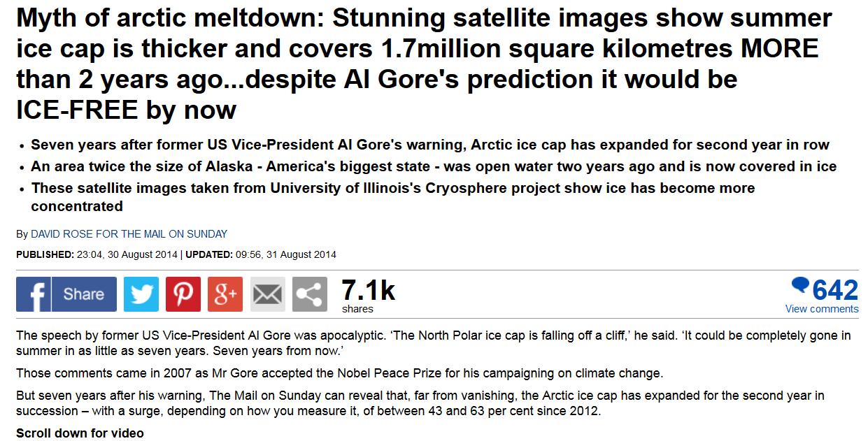
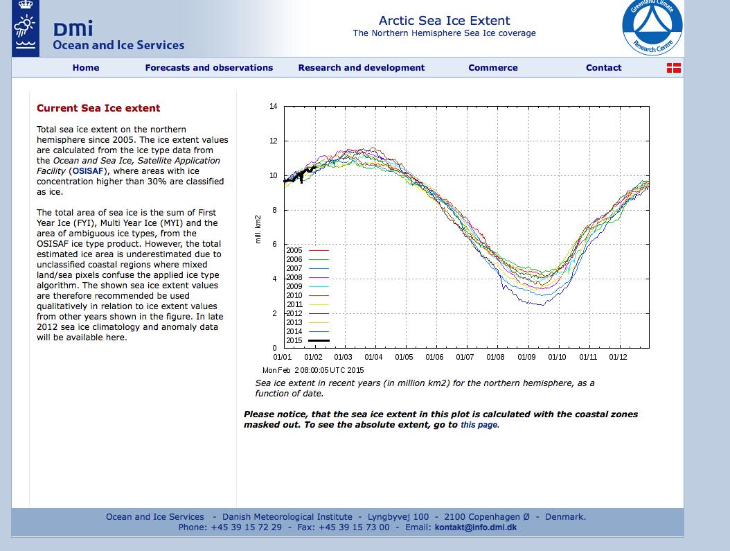
According to David Rose’s latest article in the Mail on Sunday it has. This came as shock news to me, because only a couple of days ago I was discussing with “Steve Goddard” how Arctic sea ice extent (using “Steve’s” patent pending personal “DMI 30% clone” metric) had actually decreased since the same time last year!
Before we delve deep into the data, and before the Mail on Sunday makes any “corrections” to David’s misleadingly purple prose, here’s how things look over there at the moment:
Them:
As you can see, the Mail’s main claims are:
Seven years after former US Vice-President Al Gore’s warning, Arctic ice cap has expanded for second year in row
An area twice the size of Alaska – America’s biggest state – was open water two years ago and is now covered in ice
These satellite images taken from University of Illinois’s Cryosphere project show ice has become more concentrated
not to mention that:
The Mail on Sunday can reveal that, far from vanishing, the Arctic ice cap has expanded for the second year in succession – with a surge, depending on how you measure it, of between 43 and 63 per cent since 2012.
For some strange reason David neglects to include any numbers for 2013, so….
Us:
A quick telephone call revealed that John Wellington doesn’t work at the Mail on Sunday’s, so I sent him an email instead:
“The Mail on Sunday can reveal that, far from vanishing, the Arctic ice cap has expanded for the second year in succession”
I don’t suppose David and/or the Mail on Sunday can provide any data to back up that assertion can they?
Best wishes,
Jim Hunt
Them:
Hello Jim,
I did wonder if we would be corresponding, again.
I will be in touch after the weekend.
Best regards
John
Us:
Hi Tessa,
I’m working on the assumption that you are still responsible for this subject. If not perhaps you can pass this email on to the relevant person?
David Rose is talking about the Arctic on the Mail Online again, so I’m attempting to comment again. Yet again I can’t see my comments (under the nom de guerre “SoulSurfer”) anywhere underneath the article in question. Can you look into it please, and let me know what the problem is?
To make things easier for you I’ve just commented for the third time this morning, as per the enclosed attachment.
Thanks,
Jim Hunt
Them:
In an email dated September 6th 2014:
Dear Jim,
Sorry not to reply sooner. The article relied on data from the US National Snow and Ice Data Centre comparing ice cover on the same date, August 25. In 2012 the figure was 3.91m sq miles, in 2013 it was 5.59m and in 2014, 5.62m. You may wish to note that the article did point out that the long-term trend is still downward.
Best regards
John
Us:
In an email dated January 24th 2015:
Dear John,
Sorry not to reply sooner. The PCC decided to laboriously mutate into something called IPSO right around the time of the 2014 Arctic sea ice minimum extent. Hence the brief hiatus. However David Rose is at it again, and he’s now even discussing tricky things like “probabilities”! IPSO do now seem to be getting their act together as well. Did you see their “open letter to publishers” last month?
No doubt I will have more than a few bones to pick with David’s article last weekend, not to mention the subsequent one by Victoria Woollaston. Is that one your responsibility too? For the moment though, perhaps we can pick up where we left off last summer?
Thanks for your information about the long term Arctic sea ice trend and the NSIDC extent numbers. However the article in question also states:
“Figures from the Danish Meteorological Institute suggest that the growth has been even more dramatic. Using a different measure, the area with at least 30 per cent ice cover, these reveal a 63 per cent rise – from 2.7 million to 4.4 million square kilometres”.
Where did David get those DMI numbers from? I asked the DMI, and even they didn’t seem to know!
Best wishes,
Jim Hunt
Them:
In the absence of any response from John I called the Mail offices on January 26th 2015. It seems John is out of the office for the next two weeks. His PA is now looking into matters for me.
Us:
I sent a further email to John and Poppy on February 2nd 2015:
Them:
Dear Jim,
If you have a complaint about last Sunday’s article, you should set out exactly what it is. If you disagree with any opinions expressed you are welcome to write a letter that we will consider for publication.
You mention that you have sent us a number of inquiries recently. The only other, to my knowledge is that you wanted to know the source of some data that David Rose mentioned in an article some months ago. David Rose told me it came from the official website. Perhaps my colleague Poppy Hall can find it for you since David is probably unwilling to help after your insult.
Best regards,
John
Us:
Dear Poppy (and John)
Please would you ask David to let me know where exactly, and on which “official website”, he obtained the DMI extent numbers he quoted in his article last Summer?
FYI John, at Poppy’s suggestion I have also emailed the editorial team @MailOnline. They have yet to even acknowledge receipt of my email of January 26th.
Best wishes,
Jim Hunt
Them:
Dear Jim,
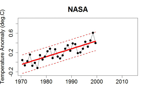
David is unable to find the table with the numerical data. But he says that the graph here from the DMI website makes it clear that if you look at 30% concentration, the figures he gave were correct.
I hope this answers your query.
Kind regards,
Poppy
Us:
Dear Poppy,
Just to clarify, the facts of the matter are that David Rose did NOT obtain the DMI numbers he quoted last summer from a “table with the numerical data” on an “official website”?
Best wishes,
Jim Hunt
Them:
We’ll keep you posted!
This website uses cookies to improve your experience. We'll assume you're ok with this, but you can opt-out if you wish. Cookie settingsACCEPT
Privacy & Cookies Policy
Privacy Overview
This website uses cookies to improve your experience while you navigate through the website. Out of these, the cookies that are categorized as necessary are stored on your browser as they are essential for the working of basic functionalities of the website. We also use third-party cookies that help us analyze and understand how you use this website. These cookies will be stored in your browser only with your consent. You also have the option to opt-out of these cookies. But opting out of some of these cookies may affect your browsing experience.
Necessary cookies are absolutely essential for the website to function properly. This category only includes cookies that ensures basic functionalities and security features of the website. These cookies do not store any personal information.
Any cookies that may not be particularly necessary for the website to function and is used specifically to collect user personal data via analytics, ads, other embedded contents are termed as non-necessary cookies. It is mandatory to procure user consent prior to running these cookies on your website.