Our Twitter feed has suddenly been inundated with messages to the effect that:
Global sea ice makes a strong comeback as El Nino fades.
First up was Professor Judith Curry on April 12th, with:
@curryja I'd be somewhat dubious about a strong ENSO-sea ice link. Not much of a response during 97/98: https://t.co/D1oyDvyCxg
— Zeke Hausfather (@hausfath) April 12, 2016
You will note that we were not the only ones to swiftly conclude that Judy’s assertion was lacking both veracity and verisimilitude! Then this morning came our old friends at the Global Warming Policy Forum with:
As El Nino Collapses Global Sea Ice Makes A Strong Comeback – See more at: https://t.co/SdWaC7Ve2d pic.twitter.com/4H7K0Ju6n3
— GWPF (@thegwpfcom) April 13, 2016
You will note that the GWPF adorned their “Tweet” with a graph purporting to show “Global sea ice anomalies”. We can only assume that Benny Peiser hadn’t read this April 11th article of ours, which pointed out that:
NSIDC has suspended daily sea ice extent updates until further notice, due to issues with the satellite data used to produce these images. The problem was initially seen in data for April 5 and all data since then are unreliable, so we have chosen to remove all of April from NSIDC’s archive.
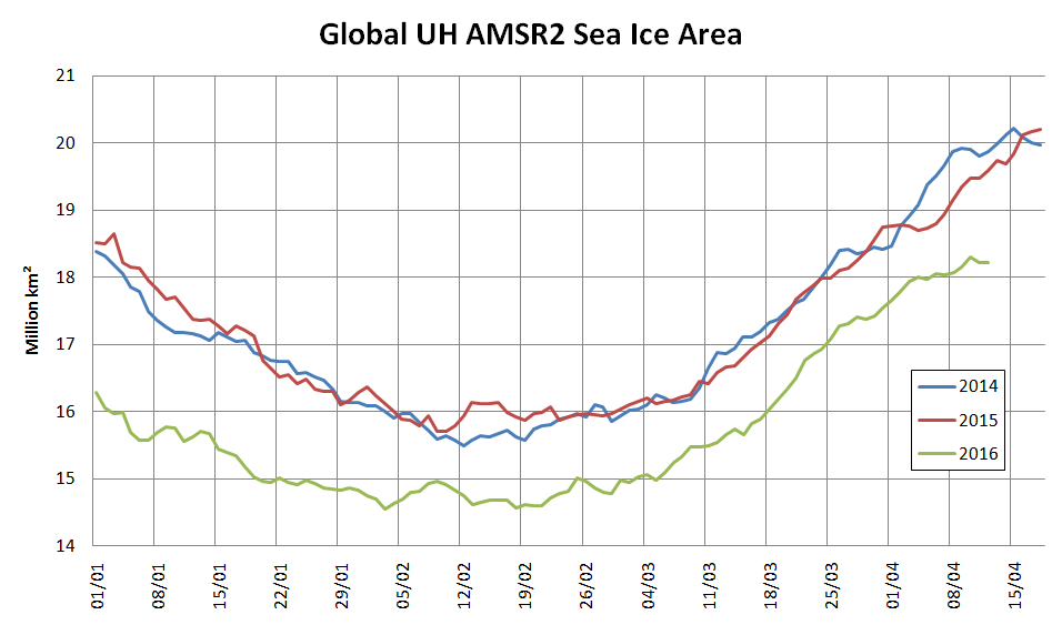
To remedy that (no doubt?) inadvertent oversight on Benny’s part here is a graph we prepared earlier of absolute global sea ice area using reliable data from the AMSR2 instrument on the Japan Aerospace eXploration Agency’s SHIZUKU satellite:
The GWPF were followed this afternoon by Anthony Watts with:
Global Sea Ice Makes A Strong Comeback https://t.co/XeKm0j4Cbp pic.twitter.com/JNXWjdiIOH
— Watts Up With That (@wattsupwiththat) April 13, 2016
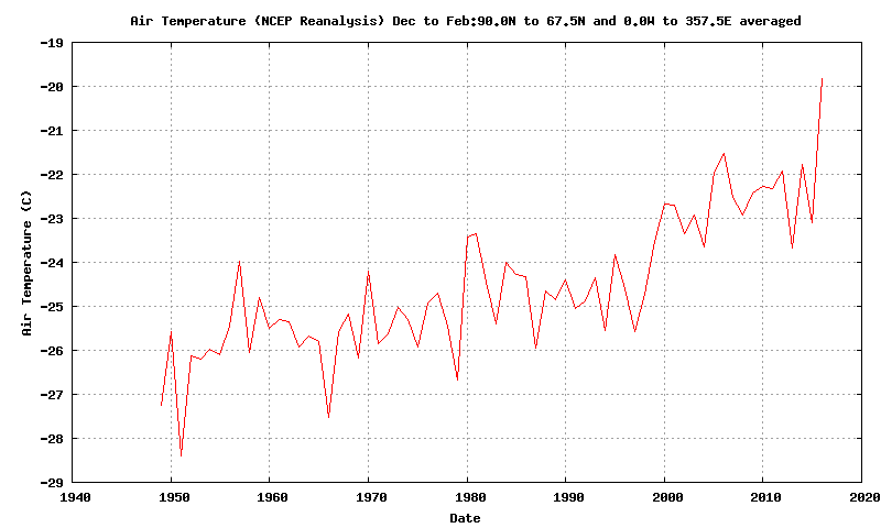
Both Prof. Curry and non Prof. Watts adorned their “Tweets” with a graph allegedly comparing “global temperature” with “tropical temperature”, but provided no graph of “polar temperature”. To remedy that (no doubt?) inadvertent oversight here is one we prepared earlier:
All members of this team of synchronised “Tweeters” provided links to an April 11th article by a certain Paul Dorian entitled, believe it or not:
“Global Sea Ice Makes A Strong Comeback”
Note in particular the part of Paul’s article that states:
In an interesting twist, the recent analysis found that the global ice area remained stable throughout the 1980s and the 1990s, while temperatures climbed suggesting “the global sea ice area is not particularly a function of the global average surface temperature.” [Source: Willis Eschenbach/”Watts Up With That” web site]
We can only assume that Paul Dorian hadn’t read this April 10th article of ours, which pointed out amongst other things that:
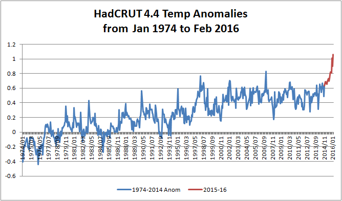
One feels compelled to ask why Willis’s global average temperature graph neglects to mention 2015 when he implies that it does?
Here’s an up to date version of one of those that Bill The Frog prepared for us earlier:
We must further assume that Paul hadn’t read this April 11th article by Mr. Watts either. It stated that:
A few years ago in 2009, I was the first to notice and write about a failure of the instrumentation for one of the satellites used by the National Snow and Ice Data Center (NSIDC) to show Arctic Sea Ice extent. Today, we have what appears to be a similar problem with satellite sea ice measurement.
It seems that Paul Dorian has finally read at least one out of all these informative articles, because the latest revision of his own piece of imaginative fiction now starts:
The source of global sea ice information cited in this posting was NOAA’s National Snow and Ice Data Center (NSIDC). They are now reporting issues with the satellite data used to produce these images and this information was not known at the time of the writing of this article.
Do you suppose we can now expect a similarly “fulsome apology” from the other players in this tragi-comic farce, together with all their rebloggers, retweeters, plagiarisers and other assorted acolytes?