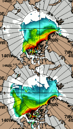
No sooner had I pointed out on the Arctic Sea Ice Forum that:
My project consists of learning a bit of Gimp whilst now being able to swiftly debunk “Goddard” et al. when they match a typical “Shock News!” headline with an apparently random graphic.
than “Steve Goddard” (AKA Tony Heller) published the headline above accompanied by the following:
Them:
Over the past two years there has been a large increase in 1.5+ meter thick ice in the Arctic, and the thick ice has shifted nearly 1,000 miles to the west – making it safe from winter winds pushing it out into the Atlantic. Both of these facts spell complete disaster for Arctic death spiral alarmists.
Us:
You realise I’m gonna have to quibble with you on this one Tony?! What exactly are you comparing there, and why is it 1.5 m this time when it was 1.0 m last time?
Is that supposed to be August 14th 2012 versus August 14th 2014?
Them:
Uh, Jim –
The legends from 2012 and 2014 are identical. It is everything over 1.5m (i.e. teal, green, yellow, orange, red, maroon taken together). The area covered by those colors is much larger in today than 2 years ago, and it has expanded westward.
Is this really that hard???
Us:
Uh, you tell me David.
The dates are missing from Tony’s animation, unlike on this visualisation which I prepared earlier today. Wanna play “spot the difference” with me?
@SteveSGoddard There isn't much #Arctic #SeaIce left over 1.5 m thick! Here's the evidence: http://t.co/GXlLuwNyUe pic.twitter.com/cB02O73XY0
— Jim Hunt (@jim_hunt) August 14, 2014
Them:
Jim, why did you change the color code from the one used at the site? Why do you color all ice below roughly nine feet thick white? Why doesn’t your map include a key, so that people can see that what is blue in your map is green in our hosts map?
I would say you are the one who is generating a false impression. To insinuate our host is doing so generates a second false impression. You need to stop doing this. It is bad for you.
Us:
Caleb – I didn’t do any of those things that you accuse me of. If you don’t believe me here’s my visualisation with the color key included. Where are our gracious host’s equivalents?
@SteveSGoddard @ret_ward @rgnldprrn I've shown you mine. Now you show me both of yours! http://t.co/O2ZrKpCPla pic.twitter.com/Mfb8qQ04kH
— Jim Hunt (@jim_hunt) August 15, 2014
Them:
We’ll keep you posted!
