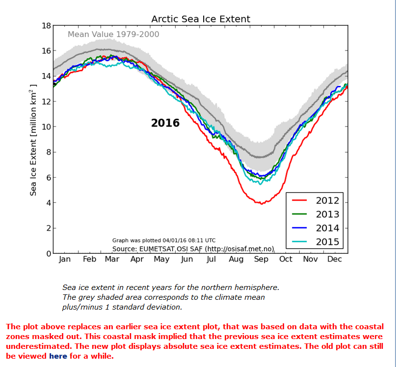
When I pose that question I’m not referring to the Danish Meteorological Institute’s long “deprecated” 30% concentration threshold Arctic sea ice extent metric so much as the reaction to its demise amongst the more “skeptical” of we cryospheric bloggers. Here once again is the “controversial” graph in question, archived from the start of the year:
No sooner had Paul Homewood moved on from that topic to finally reproduce on his blog an NSIDC Arctic sea ice graph I first brought to his attention last spring than across the Atlantic in the good ‘ol US of A a certain Mr. Anthony Watts suddenly loudly proclaims that he “tends to agree” with Mr. Homewood’s assertion that:
There has been so much skulduggery going on in the climate establishment in recent years that it is hard to avoid the conclusion that this graph has been withdrawn simply because it gives the “wrong” results.
Given the actual facts of the matter this is peculiar enough, but then things get positively surreal. Regular readers will realise that up here in the penthouse suite at the pinnacle of the tallest of the Great White Con Ivory Towers we pride ourselves on our surreal sensibilities. Today though, we are forced to admit that WUWT has beaten us at our own game. Whilst we were conducting a perfectly sane interview with one of the world’s top sea ice scientists Tony was concocting these perfectly formed surrealist fantasies.
In his update 1 to this already nonsensical story Anthony assures us that:
The typical haters, such as Neven Acropolis, are making claims in comments that I see this as some sort of “conspiracy”. I do not and any such claim is false and political in nature.
Mr. Watts is evidently a big fan of William Burroughs, and has used his celebrated “cut-up” technique to transform “Skulduggery going on in the climate establishment” into “magnets cued she got on the inimitably ginger skull” which is obviously not even slightly conspiratorial.
Let’s move swiftly on to update 2, wherein we are told:
DMI has an entire page dedicated to the use of the 30% concentration value that is still operational!
However if you read the small print on Anthony’s accompanying image it says that:
The maps are additionally overlayed with the corresponding multi-year monthly mean of the periods 1978-2014.
and if you click the accompanying link you will discover that there is no way on Earth to persuade the DMI web site to display “operational” data from 2015, let alone 2016.
Whilst we eagerly await the no doubt imminent arrival of What’s up with that Watts DMIgate update 3 we will leave you with some words of wisdom from Dr. Walt Meier of NASA, the aforementioned top sea ice scientist, who informed us earlier today that:
Regarding DMI, the issue seems quite simple. The 30% plot is an older version that they stopped supporting as they transitioned to the 15% plot.